CASE STUDY
Designing a product comparison feature for the Busch Vacuum website
About the project
Busch Vacuum came to us with their corporate design manual which focussed mainly on print products, and the wish for a website redesign. Their old website was very text-heavy and generally needed a visual refresh. They specifically wanted to display their very diverse range of products in an accessible manner, without making it look “dusty and boring” (their words).

About Busch
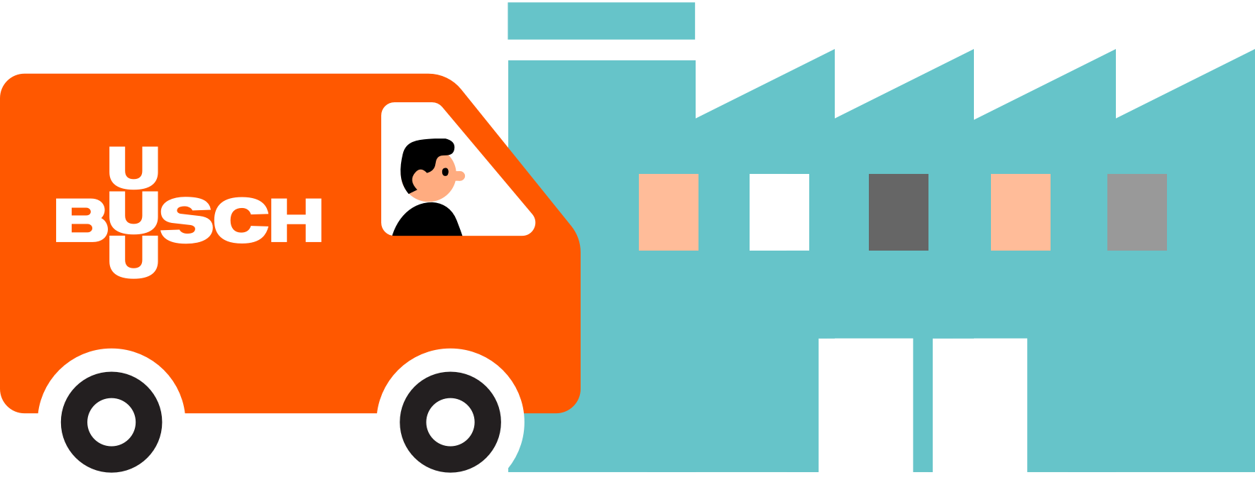
Busch is a family owned and operated business. They employ 3500 people worldwide, have offices in 44 countries and 6 production sites. Their product range includes pollutant emission control systems, measuring devices and vacuum systems, but their focus is on vacuum pumps.
What even are vacuum pumps?
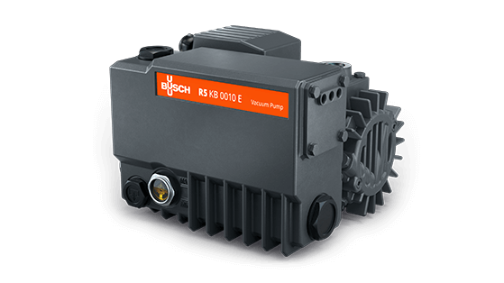
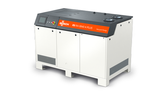
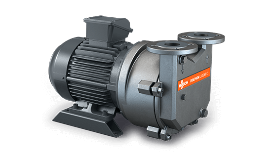
Vacuum pumps are used to remove air and gas molecules from a process. They are used for things like packaging food, drying things (for example to make paper), and picking large things up (and putting them down again).
My part in all of this
I owned the entire design side of the project. I created a design system for Busch based on their CD manual. This included a style guide for digital products, guidelines for interaction design, animated illustrations and a pattern library. I drew wireframes, delivered a high-fidelity prototype for the website and was the primary contact for all stakeholders on the Busch side. I also conducted the developer hand-off.
For the purpose of showcasing my design process, this case study focusses on the conception and design of the product comparison feature.
Why do we even want this feature?
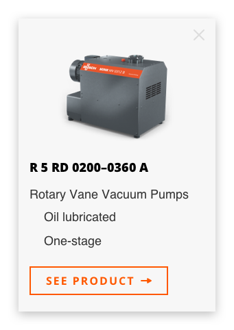
While the vacuum pumps in Busch’s catalogue have very specific uses, there are often different models or types available. Users come to the page to check which one might work best for them, and need the option to compare technical details.
We built a filter option to help users find the products that best fit their use case, but soon realized that even with the filter a user might still end up with a long list of pumps. With the product comparison feature, they can then choose the most promising candidates from the list for comparison.
Comparing products often happens without a native function by users opening several tabs at once and switching between them. The detail pages for pumps are highly detailed though, while the comparison view provides more compact information.

Goals
User goals
Users need an easy way to compare products and get an overview of technical specs. This helps them decide which product best fits their needs.
Business goals
Easier decision making will lead to an increase in purchases or potential customers reaching out to Busch for more information.
Impact
An easy to use product comparison feature simplifies decision-making for potential customers.

Key Objectives
Compact overview
How might we give the user an at-a-glance overview of multiple products they’re interested in?
Pick-and-chooseability
How can we keep the overview and chosen products flexible?
Make it sneaky
How can we make this work without obstructing the elaborate filtered product overview?
With great power comes great responsiveness
How can we fit the technical information of several products into a mobile view?
Design Challenges
The Busch design is super flat, no shadows or layered elements. This means no overlays or popups or anything of that sort.
The orange and turquoise cannot touch, as it creates a horrific visual effect.
The design needed to be bold, fresh and modern but the content specifically for the comparison page and product overview consisted mostly of tables.
ouch my eyes

Research
Understanding Target Users
I learned from the team at Busch that the users of their website are as diverse as the uses of vacuum pumps, but they usually come with a very concrete or specific use case in mind that they are trying to find the correct pump for.
Competitive Analysis
I checked out other online shops to see how they built product comparison for their websites. I focussed on retailers of tech products, because they would have a similar amount of technical data and details to deal with. The most useful example was the product comparison in Apple’s online shop.
Design System
Because I had created a design system for Busch my research included going back over all modules I had built and evaluating whether I could use them to build the comparison feature. It turned out I needed to extend the library and come up with some new modules for this.
Iterating & Validating Assumptions
Through iterating on the design of the feature and talking to technical experts from Busch I learned which information and technical details of the pumps needed to be compared. This allowed me to cut down the info on the comparison page.
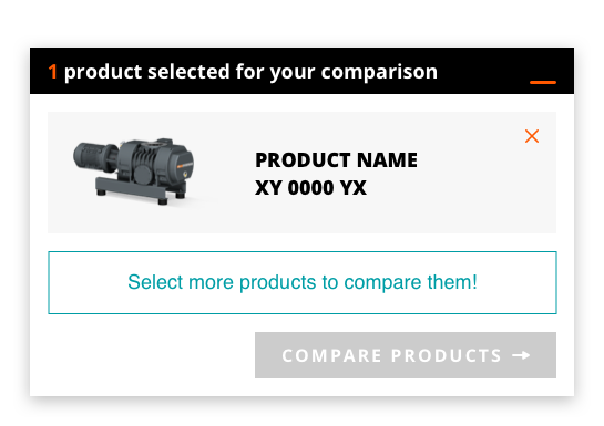
I also discovered that a maximum of three products needed to be compared at the same time, but the option to switch them out at any point was crucial.
Due to technical constraints, the product comparison couldn’t happen in an overlay or hover, so I moved to a separate page from the product overview.
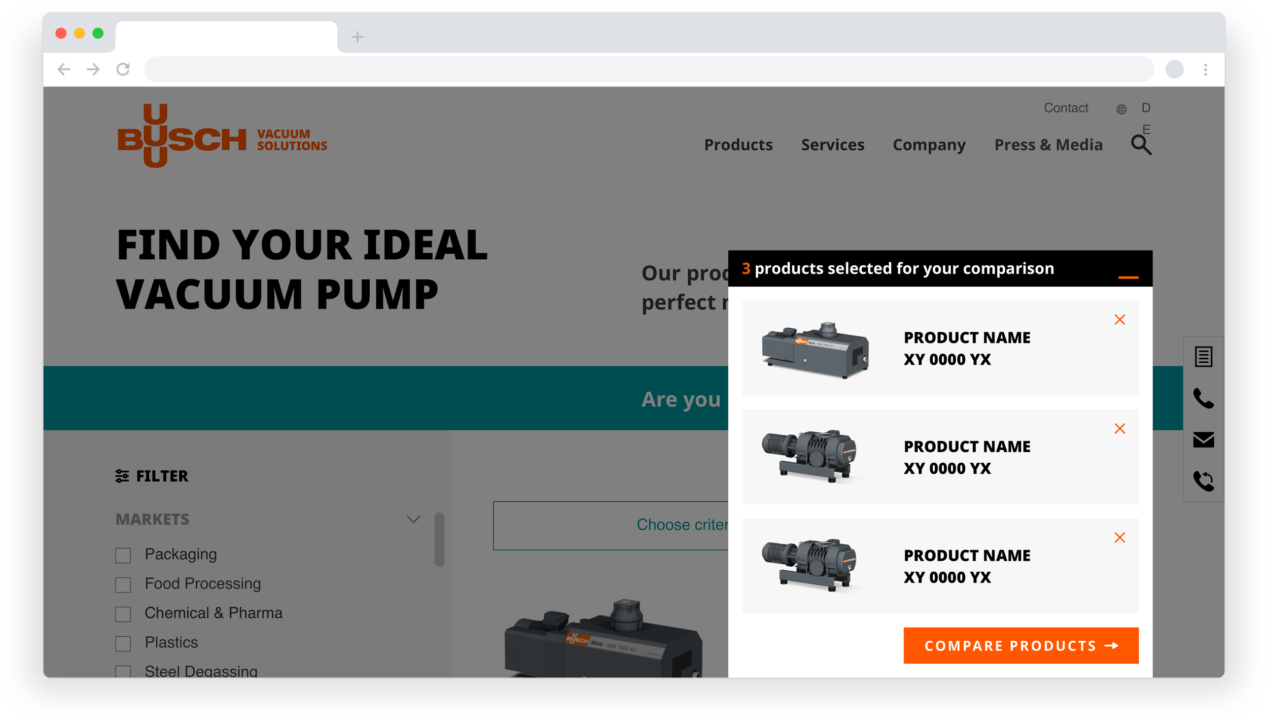
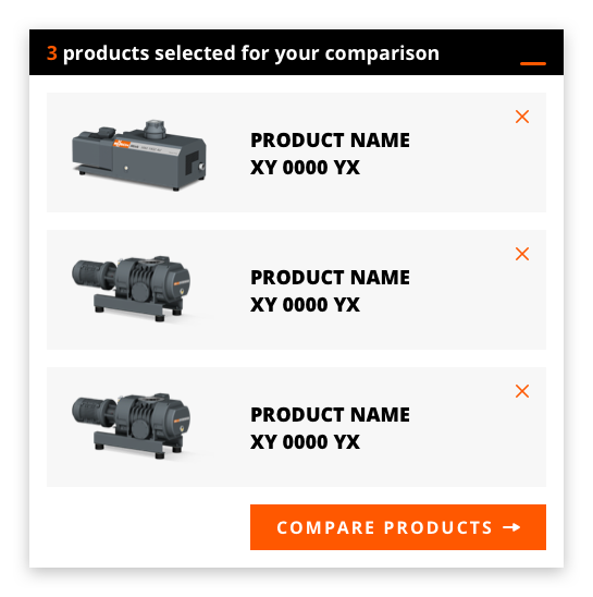
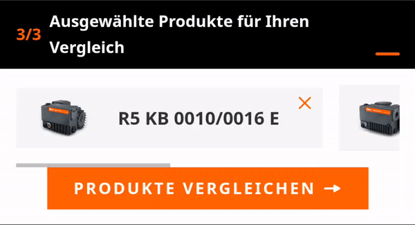
The Comparison Cart
Adding products for comparison
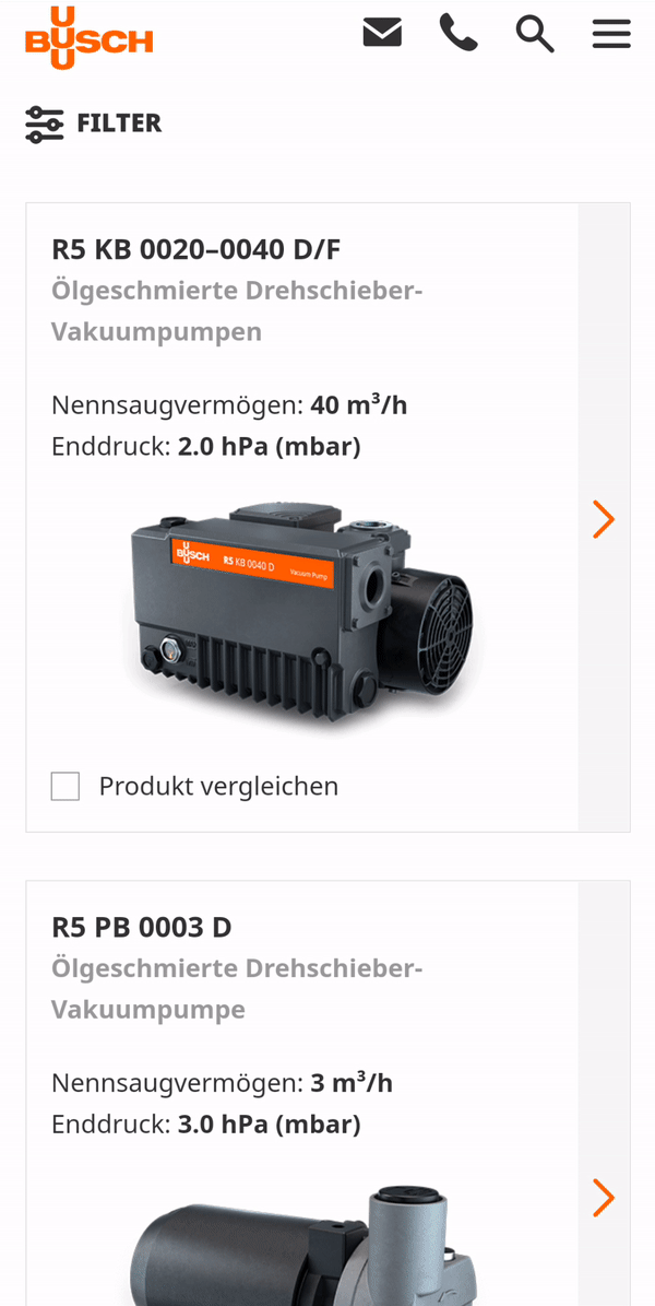
Users are able to add products directly from the filtered product list to their comparison cart.
Validation
The number of selected products and the maximum amount of selectable products are displayed throughout to keep the user informed.


The collapse
The cart collapses to a bar at the bottom of the screen and keeps the product finder visible.
Adding or removing products
The products chosen for comparison remain curateable in the comparison view as well as in the cart.
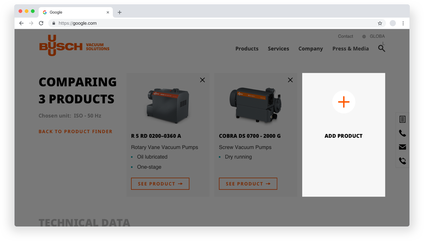
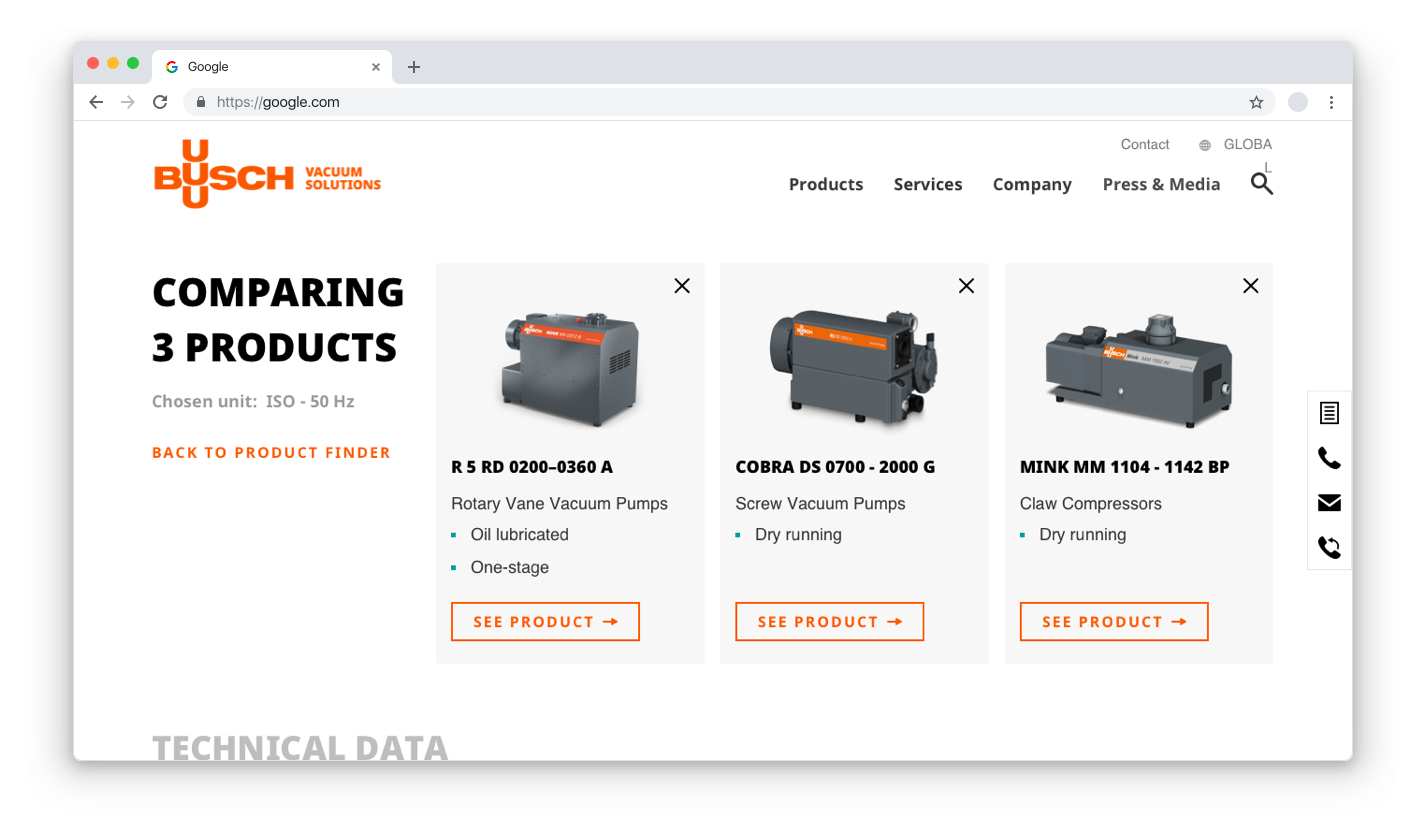
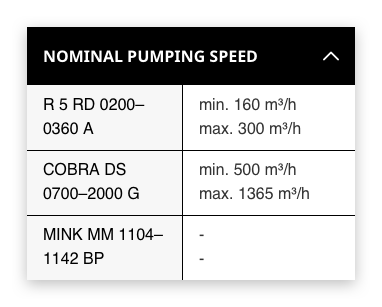
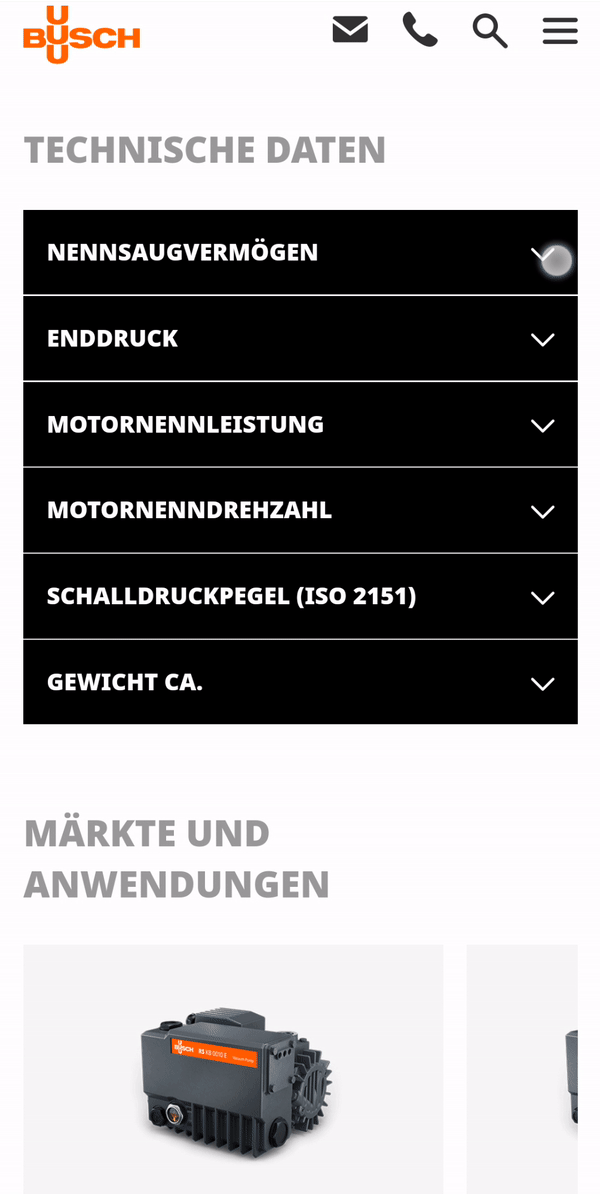
Compact tables
The product comparison view only displays the most important information about each product so they can be compared easily.
Responsiveness - Dropdown tables
The tables collapse into an accordion in mobile view. This enables the user to choose from an overview which details they would like to access.
Responsiveness - Horizontal scroll
Listing chosen products vertically in mobile view would fill the whole screen, so we added a horizontal scroll to the comparison cart.